Actovia
Updating a powerful real estate database

the beginning
Realizing the potential
Designed as a powerful search tool for New York City’s real estate brokers, the original interface was a challenge to use (to put it delicately).
The structure catered more to database developers than to those looking for a competitive advantage in the cutthroat New York real estate market—Actovia’s target audience.
There was magic there. We just had to uncover it and to make it accessible.

Digging in
Uncovering the layers
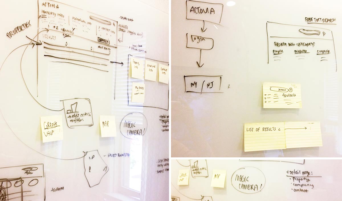
Once we were able to dig in and really mess up a white board we started to see the workflow and understand the content pieces. We thought through the use cases, what information a user would want at each stage of the process, and how would they go about getting there.
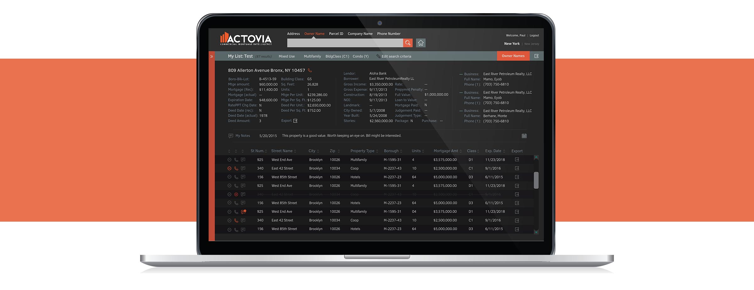
The client had a clean, modern vision in mind, but they also wanted a great deal of content to show at once on a screen as well and it needed to be understandable at a glance.

Development
The handoff
The client had an overseas developer, to whom we didn’t have much access. Since we didn’t have direct communication, I made notes to explain our decision-making process, and to guide him to make choices that aided the user.


